Friday, December 31, 2010

Vintage Bottles - Daily Painting

"Vintage Bottles" 4 x 4" oil on gessobord Daily Painting
SOLD


Happy New Year everyone....well, tomorrow actually.

Today's daily painting is of my two little Anchor Hocking vintage bottles. Love these little guys, but painting them was tough. So I took a photo, did a notan to get the darks laid down(black and white image on my computer), and then squinted really hard to get just enough detail to get the bottles to read.

The tough part was to get a composition that had some cohesion and not just two bottles sitting on a table. Besides, the shadows and the reflections were what made me want to paint them.

Thursday, December 30, 2010

Morning Snack 4 x 4" Daily Painting

Morning Snack 4 x 4" oil on gessoed board Daily Painting
SOLD


I don't usually paint apples....in fact, I can only remember one done in colored pencil years ago that was a "hide in the closet" piece. But we received this lovely box from Harry & David for Christmas from our real estate agent/good friend, and there were these two lovely apples as part of the fantastic display. Hubby ate all the pears before I could paint them, so I'm left with this one apple.


For my daily painting today, I decided to try one of these little 4 x 4 gessoed boards I got at the art store (my son gave me a gift certificate for Christmas!) They handle much different than canvas and once you lay the paint on you're pretty much done otherwise you get mud. I think the surface of these boards will work well for the classical layering approach to oil painting.

Wednesday, December 29, 2010

Cutie in a Cup - Daily Painting

"Cutie in a Cup" 5 x 7" oil on canvas board - Daily Painting
SOLD

I don't usually a bird's eye view composition (from the top), but I liked these little cuties I pirated from my son's refrigerator yesterday. The cup and the viewpoint seemed to be a little more of a challenge for my daily setup. I also used south light from the window this morning to set it up, another challenge. I am used to classical lighting from the left with a incandescent bulb. I really had to observe on this one.

Monday, December 27, 2010

Break Time - Daily Painting

"Break Time" 5 x 7" oil on canvas board
Daily Painting can be purchased here


Ooooh...back in the studio today! Very productive day, worked on my daily painting and then started glazing the background on a little larger piece. Two very different types of oil painting requiring very different skill sets.

Friday, December 24, 2010

Merry Christmas Eve!

"Mandarin Orange & Tulip Bowl" 9 x 12"
oil on board - Work in Progress

I had such fun yesterday....painted ALL day. I finished the "dead" layer on this painting and I have to say it was very satisfying. There's something about black/white paintings that I find appealing. I worked in white colored pencil on black illustration board a few years ago. "Onion" was one of my favorites.

Merry Christmas to all that celebrate this wonderful holiday, and a peaceful holiday season to everyone! However you celebrate, make it about love.

Wednesday, December 22, 2010

Working on Dead Layers

"Plain Mandarin" Dead Layer WIP
5" x 5" on Gallery Wrapped Canvas


I see "Dead Layers".....is that bad??


Anyway, the Umber layer of the two paintings I'm working on have been completed and are finally dry. They are:


5 x 5 "Plain Mandarin" on gallery-wrapped canvas

9 x 12 "Mandarin and Tulip Bowl" on Gessoed Board


Here you see the small 5 x 5 with what's called the "Dead Layer", which is nothing more than a grayscale painting in oil over the Umber Layer. I completed the dead layer today in just about two hours. You can see some of the Umber showing through which gives more depth, I think, than just a plain greyscale underpainting. So I guess that's an even dead-er layer.


OK enough silliness...off to "dead layer" the bigger painting, "Mandarin and Tulip Bowl".

Monday, December 20, 2010

It's a Crock (Pitcher)

"Pitcher" 5 x 7 oil on board
not available for sale

Warming up in the studio today with another little alla prima daily painting. Speaking of warming up, we had to open the door and the window at the studio...it was such a lovely day. We could see the dark clouds to the west, but it was sunny and 50 degrees plus in beautiful downtown Golden.


We had visitors at the studio today, some friends of June's. One friend brought her two boys, 4th grade and 1st grade. I just happened to have some extra pencil sets and gave them to the boys. They were so thrilled, you just never know what impact you might make on a child that loves art. I was one of those kids who received art supplies from a neighbor and it started my quest to learn everything I can about painting and drawing.

Sunday, December 19, 2010

While Paint is Drying

"Mandarin Orange" 5 x 7" oil on board
Sold

While I'm waiting for paint to dry on some of my more involved paintings I thought I would try a small alla prima painting. Alla prima just means no layers, painted directly onto canvas or board. In this case I did have the canvas toned with a peachy, umber-y color.

I'm not an alla prima painter or really an oil painter for that matter....but I rather like the freshness of the approach and the chance to see the brush strokes.

My studio mate, June, and I decided we need to do these every day we paint as a warmup. The cost of these daily paintings will be minimal ($18.00 includes shipping) and available for purchase on my Etsy Shop. Click here to purchase this painting.

Saturday, December 18, 2010

Mandarin Orange and Tulip Bowl - WIP - Oil

"Mandarin Orange and Tulip Bowl" 9 x 12 Umber Layer (Work in Progress)


As mentioned in my last post, I've been looking at the work of Dennis Whalen and a few other artists who use the techniques of Flemish painting.


The first thing I did was draw my composition on my gessoed panel (9 x 12). I then went over it with ink (I used a Sharpie). I can only guess at this point that the ink drawing is to preserve your drawing when you tone your canvas and if you don't like how the first layer is going you can wipe it off and still have your drawing ready to go.


Toning the canvas consisted of applying and wiping with a cloth a thin mixture of Burnt Umber oil paint. I used Walnut Oil as a medium to thin the paint. I let that dry for a day.


This picture is the Umber Layer...I've also seen it referred to as the Umbra Layer. The purpose of this step is unknown to me at this point, but I have to tell you it's the most fun I've had in a long time. Just the patient application of paint in a value study.....such tedium and so relaxing.


I'll let this dry for a couple of days, and then I apply the "dead layer".....doesn't that sound horrible??

Wednesday, December 15, 2010

Glazing on Strawberry Started

"Strawberry on a Plate" 9 x 9" oil on board

This color glazing is going much better than the cup and grapes from Monday. Things I have learned so far:


1. Some Flemish painting techniques start with an umber value study and the second layer is the "dead layer" which is the greyscale underpainting. Then go to color glazing. Check out Dennis Whalen. I skipped the umber underpainting although I can imagine it would warm things up a bit.


2. Don't put in the highlights when doing the underpainting.....it usually leaves ridges that can't be corrected without scraping the canvas/board. Only add the highlights towards the end.


3. Be careful of hard edges that you create in the underpainting.


4. A mop brush is a big help for gradations and smoothing the paint without actually pushing it around.


There may be more learnings as I go....but for the first two oil paintings done with this approach I'm happy with the direction. I just need to get familiar with my palette, mixing colors and using the medium.... in my case walnut oil.

Monday, December 13, 2010

Glazing Color over the B/W Oil Paintings

"White Cup and Grapes" 9 x 12 Oil on Board


I did two oil paintings in greyscale, a value study. I don't have a before picture of this painting, just with the color glazed on.


There must be a trick to photographing oil paintings which I have not discovered yet, because there is a lot of reflection especially in the dark background...but you get the idea.


This was a tremendous amount of fun, and a great experiment. I'm going to try more....


Monday, November 29, 2010

Oil Painting? Is the Sky Falling?

"Strawberry and Spoon" (Work in Progress) 9 x 9", oil on board


I haven't oil painted in about 5 or 6 years...maybe longer. But my studio mate, June, is having such fun that I had to join in.

My approach, for the time being, is to paint an underpainting with black, umber, and white...a value study really. When the underpainting dries I will glaze color over the top and hopefully will be easier than trying to figure out oil painting technique, color, and value all at the same time.

The resource is from a painting I took, and it is simple enough that I didn't have to paint too many complex shapes with my new tool, the brush.

Saturday, November 27, 2010

Abend Gallery Holiday Miniatures Show

I am so excited to be part of the 20th Annual Holiday Miniatures Show at Abend Gallery next month! Check out the link for info on the exhibit and participating artists. Reception is Friday, December 3, 2010 from 5-9. Both of my pieces are colored pencil.

Even more exciting is my two studio mates, Tracy and June, are also in the exhibit!

Marble Bowl and Leaves - Work in Progress

This piece, "Marble Bowl and Leaves" is 12" x 16" soft pastel on Wallis white sanded paper mounted to 4 ply Conservation board (I purchased several from Dakota Pastels.) The photos work backwards with the drawing being the last photo. The painting still needs to be finished and I will post the finished piece this next week.


Keep in mind this is one approach to painting with pastels. This process works well for Light and Shadow concepts (chiarscuro). However, good composition is necessary for working in any medium. I'm not a proponent of "happy accidents", my accidents are never "happy" and I need a way to approach all my paintings because I'm a creative "creature of habit".

Continuing to paint and work out the specifics (details)
The leaves and table cloth are yet to be "painted", and there will be all kinds of tweaking once I work on them. For one, the left jug will probably be toned down in value because I want the leave to carry the light to the marble bowl.


Blending the colors
(makes the white of the Wallis Paper go away-I use my fingers)

Blocking in the color
(gives you a good foundation for continuing to paint and add details and colors)


Blocking in the Light and Shadow Structure (should be a good abstract if done well.) The best way to see the structure is to squint your eyes.
Needs a lot of thought when composing and lighting your still life setup


Dynamic Symmetry Armature (for composition and design)
and Drawing (for placement and perspective)

Thursday, November 11, 2010

Brown Jug and Crabapples - Finished

"Brown Jug and Crabapples", 9" x 12", Pastel on Paper

Snow today in Denver! Painted at home today and stayed nice and toasty. Back to the studio tomorrow.
Finished the above painting, and it can be purchased on my website.

Tuesday, November 2, 2010

Juror's Award

"Chopsticks and Tulip Bowl", 12 x 16", pastel on paper


Over the weekend I learned that my painting "Chopsticks and Tulip Bowl" won the Juror's Award at the Estes Park "Lines into Shapes" Exhibit. The winner's (along with purchase information) can be seen here.


I was very pleased!!

Friday, October 29, 2010

Little Brown Jug - Work in Progress

"Little Brown Jug", 9 x 12" pastel on paper, (Work in Progress)

The crabapple trees in front of our new townhome have started losing their leaves, and the apples are everywhere.....but when life hands you crabapples, make a painting!

I still have a few areas to resolve, but hope to finish in the next few days....

Wednesday, October 20, 2010

Silver Pitcher and Teacup - Finished with Final Title


"Silver Pitcher and Teacup", 10 x 16" Pastel on Paper

Well, it's been a looong time coming, but I think this one is now finished. It started out with appleblossoms, then a dried rose, and today I decided it just needed a little greenery. So out to the rose garden to get a few cuttings.

Wednesday, October 13, 2010

Pitcher and Tea Roses - Work In Progress

This piece is 10" x 10" on Wallis White Sanded Paper using NuPastels, and a few Ludwigs.


Initial Sketch and Blocking of Light and Shadow
At this point the sketch is used mostly for placement
on the paper.

First Layers of Color

More Detail on Pitcher and Blocking in Rose Colors
(Light Sides and Shadow Sides)


This work in progress is to help illustrate moving from non-specific to more specifics and details. I don't paint details until near the end. The next specifics will be the roses, and then the leaves and finally the doily.

Monday, September 20, 2010

Friday, September 17, 2010

Estes Park Exhibit

"Mexican Pitcher & Cuties"
11" x 16, Pastel on Paper

"Chopsticks & Tulip Bowl"
12 x 16" Pastel on Paper


Woohoo! The two pastel paintings shown here were accepted into the Estes Park 14th Annual "Lines into Shapes" Multi-media Art Competition and Sale, October 29th-November 14th, 2010.
The exhibit will be at the Art Center of Estes Park, 517 Big Thompson Avenue, Estes Park, CO.
Website for the center.

Thursday, September 16, 2010

Teacup & Tiny Roses - WIP

"Teacup and Tiny Roses", 6 x 9" Pastel on Paper
(Work in Progress)

I love porcelain teacups, and I enjoyed painting the one in "Silver Pitcher and Dried Rose". So I thought I would try another teacup, this time with tiny little roses from outside our studio.

When I set this up (including lighting) I photographed it as a whole and closeups of the components. I still have the teacup set up in my still life box, but the roses didn't make it through the day. I am painting from life as well as the photograph, which is tricky because the colors change from real life and as seen through the technology of the camera/computer. I try to use the shapes from the photo and the color harmony from the real life set-up.

The painting is 6" x 9" on White Wallis paper. So far I have captured the light and shadow shapes, blocked in some basic colors and blended a bit....a bit more blending on the teacup.

A ways to go to finish, but a good start...

Thursday, September 9, 2010

Change in Title - Still a WIP

"Silver Pitcher & Dried Rose" (Work in Progress)
10 x 16" Pastel

This has been on the back burner forever, mostly because I got hung up on painting the apple blossoms. Then it hit me, with a little help at a critique......get rid of the apple blossoms and paint something else that does work. So I brushed out the offending little blossoms and have blocked in a dried rose. I like the colors and shape much better.

I also smooshed a lot more oranges and rusts into the midtones, more greens and browns into the shadows, and more yellows and light peaches into the lights. Today I began putting in the specifics that will help the form of each object. The silver pitcher and the teacup are pretty much finished.....still working on the mini jar, the dried rose and the foreground.

Slowly but surely, I am getting to the end.


Saturday, September 4, 2010

Thursday, September 2, 2010

The September Give-Away Begins

I have posted my September entry , "String Theory", for the Bold Brush Online Competition. If you haven't ever checked out the quality of the artwork in the competition, please do. There are some fabulous pieces in the July award winners. August winners will be announced by Sept 20th. When you click the "like" button on the webpage, then please leave your name here at my blog in the comments of this post. I will start putting names in the "hat" for September. Last month we had 40 people in the running for an art note card. So I decided to do two cards. If we get 40 this month we'll do two cards.

For my artist statement on this colored pencil painting check out my website.

The art note card for September's give-away will be my most popular image, "Tea & Sympathy".

Good Luck!

Wednesday, September 1, 2010

Winners in the August Give-Away!!

Congratulations to the two winners in this month's give-away, Julie Sorensen and Aura Leigh Ferguson.

I appreciate all the support from my friends and art followers for voting for my painting in the Bold Brush Online Competition. All of those who "liked" my painting had their name put in the "hat" to win an art note card of my August entry, "Red Rocks". My painting ended up #23 out of about 425 paintings in the Popular Entries category.

You'll have a chance to play for the month of September as soon as I post my entry, I'll let you know.

Cheers!

Sunday, August 29, 2010

Chiaroscuro, Connections and Lost Edges

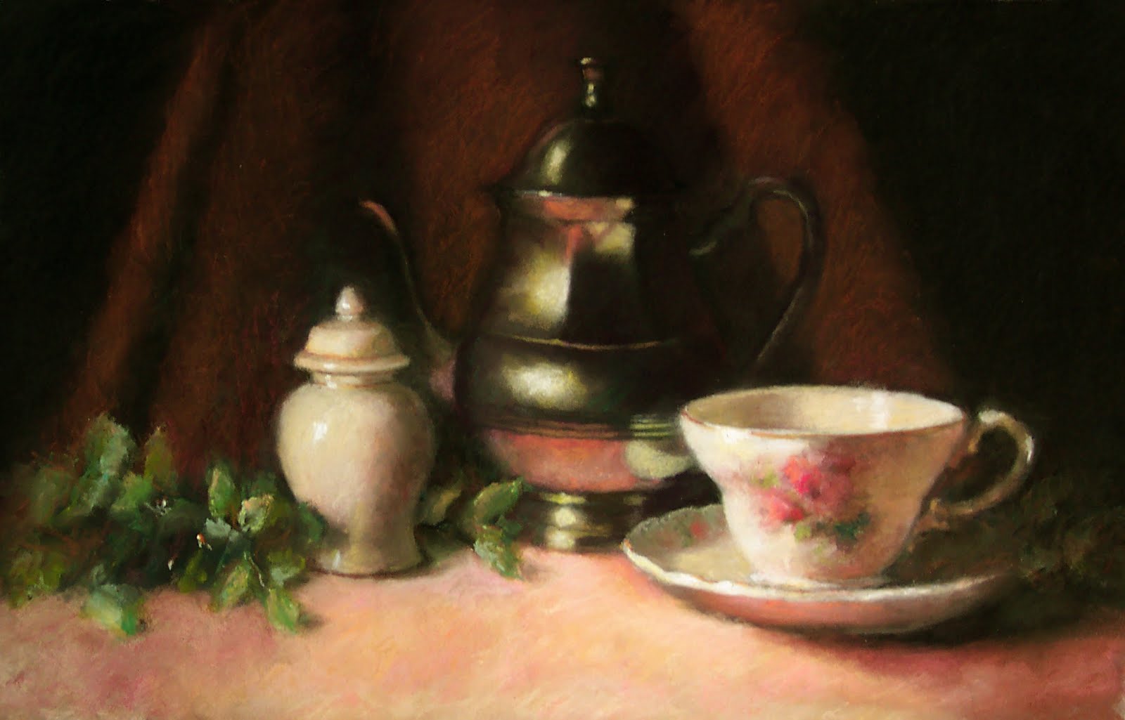
I worked on this today, a lovely quiet day at the studio. One of the things I wanted to do with this piece was to create more of a chiarascuro effect. To me chiaroscuro is more the extreme end of the Light and Shadow approach to composition and painting. Hopefully you'll see the difference between this version and the last.

This is a real nuance, but in Light/Shadow or chiaroscuro the painting is about the light on the objects....not the objects themselves. In my earlier version it was a nicely rendered pot but the lighting was pretty mild. In this version I have darkened the shadows quite a bit. I've also darkened the berries that fall behind the ones in front. I'm also starting to add darks to the leaves.

"Connecting" the darks is an important concept in Light/Shadow or chiaroscuro. In my limited Photoshop capabilities I've shown how you can follow the darks across the painting making it easy for the viewer to move from left to right, just like reading a book. In a perfect world I would have created a lovely abstract shape with my dark structures before I started painting, but sometimes I don't spend enough time doing that. Here is a blog post about how you would create that kind of structure...it's done in colored pencil but you get the idea.

I have two pics here, one of the painting modified in Photoshop with a line running through the darks and I have circled three places where the edges are "lost" which will also help the viewer move through the still life. Edges are like gateways, you can stop the viewer with a hard edge or move the viewer through the painting with a "lost" edge.

I still want to develop the leaves a bit more....but then I'll probably be done.


Thursday, August 26, 2010

Berries and Mini Jar - WIP

"Berries and Mini Jar" 6 x 9" Pastel on Paper
Work in Progress


After taking the summer to paint landscapes, it's time to get back in the "still life" groove. I was kind of rusty yesterday, but the painting came much easier today.

This is a still life/photo combo painting. I set up the arrangement, and then did a pencil drawing to capture the light and the shape of the leaves. I knew the leaves wouldn't make it more than a day or two with the hot lights on them. I also had to move the berries in the real arrangement to get a reference for the berries on the right side in the shadow.

Hoping to finish it up maybe tomorrow or over the weekend. Feels good to get back to the still life and what I learned with Deborah Bays. Speaking of which, taking it to a critique tonight with Deb....we'll see what she has to say. Smile!

Sunday, August 15, 2010

Tea & Sympathy

"Tea & Sympathy" 8 x 14 Colored Pencil


Yesterday, I was thinking why doesn't the Bold Brush Online Competition allow colored pencil as a medium. So I sent off a note to the EXCELLENT technical support at Fine Art Studio Online (FASO) to ask that very question. In their usual prompt and professional fashion replied "It is an acceptable medium". Yippee!!

So I have entered my second painting for this month, "Tea and Sympathy", a colored pencil painting. See the right sidebars which are provided to us by FASO.

My first entry fee for "Red Rocks" was free since my website is hosted by FASO. The second entry fee was $14, but it will be great to have colored pencil represented in the competition. I think I have only seen one other entered, which is why I wrote to ask if it was legal.

I'm a happy girl!

Monday, August 9, 2010

Great Kids' Exhibit

As President of the Lakewood Arts Council I have another blog...I just posted a wonderful piece written by one of our LAC members, Jane Dorsey, with pictures by another member, Ann Quinn. It's worth reading!

Saturday, August 7, 2010

Support My Art by Voting..Win an Art Note Card

"Red Rocks" 11 x 14 Pastel on Paper

My BoldBrush Art Competition August entry is "Red Rocks". If you click on the right side-bar badge it will take you to the web page for my entry. Please click on the "like" button (only works if you have a FaceBook account) and leave your name in the comments section of this post. On Sept 1, I will put all the names of supporters/voters in the "hat" and select a winner.

The winner will receive a professionally printed art note card with the "Red Rocks" image. It comes with an envelope and presented in a plastic sleeve. I will contact the winner for mailing instructions and post the winner here.

The more votes my painting receives, the higher in the "Popular Entries" it ranks. It's good PR for me. Thanks so much!!!

Thursday, August 5, 2010

Number 17

"Number 17" 6 x 8" Pastel on Paper

After a week in Santa Clara, it was tough getting back to painting in the studio. I was exhausted and had more things on my plate than I had when I left. I swear whenever you go away the work doesn't pile up at a normal rate, it piles up exponentially.

So the goal here was just to paint, get those NuPastels moving and start getting my "hand" back. That's the lovely thing about this 100 Project is that when you don't know what to do, you paint the next number in line. Takes a lot of the procrastination out of painting. This is not a particularly interesting or good piece, but you learn to let go of the results and just paint.

Happy Painting to you! Whatever you do, make a mark on the paper today......

Monday, August 2, 2010

Announcing the July Winner of Art Note Card

"Colorado Gold" Pastel on Paper


In July I posted if you signed up for my e-mail newsletter your name would go in the "pot" and you could win an art note card, "Colorado Gold".


I have randomly selected the winner!!!! Drum roll please.......Gayle Uyehara.....of CA. Congratulations Gayle!

I have a new "giveaway" planned for August so stay tuned......

Tuesday, July 27, 2010

First Visit to the Gallery in Los Gatos

First meeting day of the CPSA National Governing Board is always a busy one. Meeting all day, trying to get through regular business and policies before we have to turn our attention to the "festivities" that begin tomorrow night for our general membership. Our final event is a Saturday night dessert reception at the hotel. I'll be exhausted by then and my attention span will be so short, not to mention my throat will be hoarse and dry.

Tonight was a private exhibit tour and dinner for the National Governing Board (12 of us) plus the District Chapter representatives who have flown in from all over the country. The exhibit is lovely with many wonderful pieces.

Off to bed to get ready for tomorrow!


The Art Museum of Los Gatos, California


One of my favorite pieces done on wood..large and lovely


Exhibit Pics

Friday, July 23, 2010

Number 16

"Number 16" 6 x 8", Pastel on sanded paper

Getting ready to fly to Santa Clara on Monday afternoon for the big Colored Pencil Society of America Annual Exhibit and Convention (check http://www.cpsa.org/ for details). Therefore, I haven't wanted to start a larger piece, but I want to continue to paint....Project 100 is great for this purpose.

This painting is 6 x 8 on Colorfix sanded paper, rust colored, using my favorite scribble stroke. I've included the start of this painting below so you can see how loose my strokes are when I begin. The get tighter as I progress but never quite obliterate the rust of the paper underneath...that's an effect that I really like. With white paper you get white flecks, with colored paper you get the color showing through in little flecks.


Number 16 work in progress

Thursday, July 22, 2010

Project 100 #15


"Number 15" 6 x 8 Pastel on paper
I rephoto'd the painting on 7/23/10 in a better light


Cloudy cool day at the studio today and I wanted to paint a pastel to add to my Project 100.


This is 6 x 8 on sanded w/c paper. A couple of things I have learned about working on this type of paper.


- I've only been able to use the softest of pastels to keep from having an overworked look. The scribble stroke I like to use doesn't work for me on the sanded w/c paper.


- Depending on much you sand the paper, you will have little flecks of white. The less you sand, the more the flecks. The less you sand (or the thicker you pile on the pigment) the more white flecks you get. I think the flecks could work for you in a landscape, but a still life is more questionable as to how the flecks would add to the overall painting.


To produce this sanded paper, I use 140 cold press (not rough) w/c paper and a 300 grit sanding block. I sand by hand and I don't know if I would have the patience to sand anything larger than a 6 x 8", honestly. But it's been fun to use for the recent pieces.


On to number 16!

Tuesday, July 20, 2010

Great News!

"Brass Pitcher and Onions" 10 x 12 Pastel


I was notified yesterday that my pastel painting, "Brass Pitcher and Onions" was selected by juror/judge, John Lencicki, for inclusion in the Louisville Art Association's 25th Annual National Fine Art Show for 2010.


The Exhibit runs from Sept 4th - Sept 12 at the Louisville Center for the Arts, with the opening reception on Sat, Sept 4th from 7-9pm.

Friday, July 16, 2010

Smallsville

"Untitled" 5 x 7 Pastel on Paper


A fun little 5 x 7" piece I worked on today. The painting is done on rust colored ArtSpectrum sanded paper. I don't really have a name for it yet, but I have a great little frame that will fit it nicely. This is the smallest pastel I think I have done.


It was a lovely day in the studio today with our fan. We don't have air-conditioning but haven't really needed it until this week. So I brought my bedroom fan in and it did the trick, moving the air around. My digital car thermometer read 104 degrees when I got ready to leave today, but it was down to 99 degrees as I pulled in our driveway. We need some rain!

Wednesday, July 14, 2010

Back in the Saddle Again!!

"Wildflowers" 11 x 14" Pastel on Paper
I worked on this in the studio today. It was so good to be back painting, with June, kibitzing, critiquing, encouraging, laughing, planning.... I feel so blessed to have my studio and June as my painting partner. We will miss Tracy...she's leaving on a cruise!
This painting was done with my scribble stroke and mostly NuPastels with a few Rembrandts and Ludwigs, but I was sort of out of practice. I will put it up for a couple of days and see what it will take to finish it.

Sunday, July 11, 2010

Are You Feeling Lucky?

I'm giving away a lovely "Colorado Gold" art note card at the end of July to one lucky person who signs up for my e-mail newletter. The note card is professionally printed and the image is perfect for the upcoming Fall season.

Please visit my website and click on the "Email Newsletter" link on the left side menu to sign up and be eligible. The winner will be contacted by e-mail for mailing information. The winner will be posted here and on my website by August 5th.

Good luck!!

"Colorado Gold" 9 x 12 Pastel

Home & Bold Brush Competition

Thanks to everyone for their prayers and good wishes for my Mom's surgery. The surgery went well, no residual cancer and she is back to her old self. Our prayers have been answered and then some.

I spent a week with her arriving back home late Friday. So good to be home....there's no place like home (I'm clicking my ruby red slippers!)

Will be back in my studio on Wednesday with a little shortcut on Monday working at the gallery, and my sweet granddaughter, Emma, on Tuesday.

There is a pastel painting on my studio easel that is about half done, and I can't wait to get back to it. Hopefully I will post it later this week.

In the meantime, July 1st, means a new start to the Bold Brush Painting Competition online. My entry this month, there may be one later in the month, is "With a Twist". If you like this painting, please click the "like" button at the Bold Brush webpage for my entry. Thanks, it would be much appreciated.


"With a Twist" pastel 9 x 12"

Monday, June 28, 2010

Thank You!

Thank you to all who have shared their stories publicly and privately with me about depression. They have all touched me more than you know.

I especially like what Jan posted on yesterday's post -

"I try to live by this mantra: Forward, always forward. This is the only way I can fight depression. The only way is to move forward; if you look back, you're not moving forward."

Here is one thing I have done to stay positive..limit my news intake. Sometimes I think it's not even news anymore but shameless selling of fear...along with a few other things ;-)

In the category of moving forward, I have posted my second entry in the Bold Brush online competition. They now have a category for "Popular Entries". Now I know this is in the category of self-promotion, but, hey, somebody's got to do it. This is a monthly online competition sponsored by Fine Art Views. Here is the link to my second entry for the month. I'm not in contention for an award (there's some pretty super art being entered), but the more people that vote for my piece the more hit's I get on my website..which is a very good thing.


"Brass Pitcher and Red Onions" 10 x 12" Pastel on Paper