For my creative friends, I launched a new blog today, "What Are You Really Selling?" Practical Advice for Selling Your Art Online. Here's a teaser....
"Whenever
other artists find out I am selling my artwork online, they want to know the
what, where, when, why and how of it all. At gatherings, they start asking
questions, as if there is a three-word magic incantation I can give them,
that if repeated will work for them.....
Come on over and check it out....
Friday, April 27, 2012
Thursday, April 26, 2012
Posterized to Finished Tomato
In my last post I showed you the resource, then grayscale, then posterized version of this tomato.
Here I have started again with the posterized version, and demonstrated how I laid in the color blocks similar to the shapes in the posterized version. The idea is to get approximate color, pretty acurate value and shape.
Once you have the first large shapes applied, you continue to break down the shapes and colors by adding additional layers of pastel. You may make small alterations to the value structure. For instance you can see I've gradated the background lightening the dark area behind the tomato and darkening the foreground area. I've also added more light to the top of the tomato.
I don't use the posterized version often, but it helps students to simplify shapes and get started on the value/color structure. I do however, always have the visual in my mind of where the darks, lights and midtones will be placed in the painting.
The finished painting took about 6 hours to complete from sketch to ready to frame.
 |
| Posterized Resource |
 |
| First Layers of Color on White Sanded Paper |
 |
| Finished Click Here to Purchase Painting |
Monday, April 23, 2012
Deconstruction of a Resource Photograph
I taught a one day workshop last Friday at Lakewood Arts Council here in Colorado. One of the "tools" I introduced my students to was Photoshop, specifically how to convert to a grayscale and then to posterize.
Many years ago I learned how to use the grayscale (or an even more ancient tool the photographers red acetate filter) to judge values. This allows you to remove the color from the resource you are painting and focus on just the values. It's also an excellent tool for viewing your final (so you think) painting and judging if you achieved the depth you were hoping for.
More recently I was exposed to the posterize function on Photoshop. Working in a light and shadow approach as I do, this is so valuable to knock down all the "noise" to the basic value structure (in these two examples there are about four values each.) It allows you, as the artist, to think of your painting in a more abstract sense and less focused on details.
My next post will be taking the posterized version and blocking in your light and shadow shapes with pastel.
 |
| Resource Photo |
 |
| Converted to Grayscale |
 |
| Then Posterized |
 |
| Resource Photo |
 |
| Converted to Grayscale |
 |
| Then Posterized |
Saturday, April 21, 2012
Pastel Class
 |
| Demo time! |
http://lakewoodartscouncil.blogspot.com/
Friday, April 13, 2012
Work in Progress..Cup and Fruit
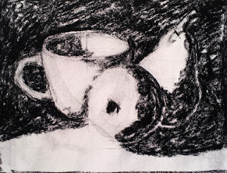
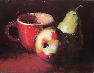
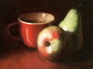
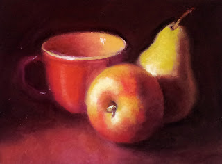
It's been awhile since I have shared a work in progress. The following images capture:
The above image depicts the sketch (you can see some of my pencil measurements on the elipse of the cup) and the identification of the shadow/dark structure. Everything else is in the light.
First layer of colors are added, maintaining the original shadow/dark structure. You can see lots of white flecks showing through which is the white sanded Wallis paper.
Sometimes I blend, sometimes not. Depends on how realistic I want the painting to be. The more realistic I want it to be then I will blend. But I always have plenty of pastel pigment on the paper, or you will sand your little fingerprints right off. Once I had it blended I realized how "chalky white" it was looking and my set-up had a really warm atmosphere.
Today's work was all about adding yellows, oranges and reds to everything. I added the stem of the apple and generally started refining shapes. I consider this 60% done. More work on the specifics of the cup and the pear are needed, then going over the whole thing to make the late stage adjustments in color and work with the edges.
 |
| Underpainting with black NuPastel |
The above image depicts the sketch (you can see some of my pencil measurements on the elipse of the cup) and the identification of the shadow/dark structure. Everything else is in the light.
 |
| First layers of color |
First layer of colors are added, maintaining the original shadow/dark structure. You can see lots of white flecks showing through which is the white sanded Wallis paper.
 |
| First layers blended |
 |
| Lots of warm colors added |
Friday, April 6, 2012
Peach...all P's This Week
 |
| "Peach" 6 x 6 Pastel on Paper Click Here to Purchase Painting |
Tuesday, April 3, 2012
Not Easy Being Green
 |
| "Not Easy Being Green" 6 x 6 Pastel on Paper Click Here to Purchase Painting |
Subscribe to:
Comments (Atom)
