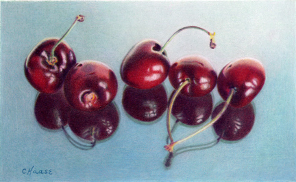
Sweet Reflections II (4" x 6") colored pencil on Stonehenge
Sold

This is the complementary underpainting for Sweet Reflections II. I chose Dark Green and Celadon Green for the cherries to create the value study. Since the reflections were part of a mostly greenish-blue surface I chose Black Grape and Tuscan Red (complements) to create the values. There is a very light pink in the background to add a little variation to the greenish-blue background. The emphasis when working on white is to model the shadow areas, leaving white paper for highlights and pure colors.
AND NOW, THINKING IN REVERSE.........

This is the underpainting for Sweet Reflections I using White colored pencil. So instead of creating shadows (see example above), I am creating the highlights leaving the shadow areas the black of the paper.
Once the white underpaint is done, then I work the dark shadow areas with color, then the midtones, then color in the highlights comes last.

Sweet Reflections I (4" x 6") colored pencil on black LetraMax
SoldThis is one of the few paintings I have done on both black paper and white paper. You can see the difference in the mood of the finished piece.

 Spiral Shells & Other Things (8" x 10") Colored Pencil Sold